In the attempt to establish a unique and distinctive image, every organization, regardless of its size, must first realize that visual identity is an essential part of the overall marketing plan. The organization’s graphic mark (symbol or logo) forms the central part of its identity. It stands as a symbolic icon of the values and prestige of the organization. This symbol or logo is integrated through the organization’s letterhead and business cards to make a strong visual impact. The three component of the completed program are as follows:
Three Components of a Visual Identity Program
- Primary Component: The Graphic Mark
- Secondary Component: The Stationary System
- Tertiary Component: Cross-Media Application
Primary Component: The Graphic Mark
A graphic mark is any word, name, symbol, or device, or any combination, used, or intended to be used, to identify and distinguish one entity from another entity. In commerce this mark is commonly called a trademark.
When an organization’s name is designed in a unique and distinctive style, it is called a word mark. If an organization chooses to use a graphic identifier to project its essence, vision and mission, this organization is using a symbol. When the organization uses the combination of the word mark and the symbol as its official graphic mark, it is using a logo, also called a signature.
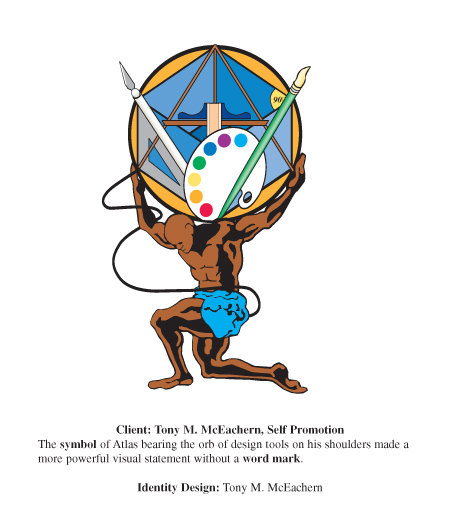
A special type of symbol used from time to time is the character mark. In the book, Branded? Products and Their Personalities, Gareth Williams says that characters allow brands to maintain relevance as they can engage in the contemporary events that are pre-occupying their consumers. Tony the Tiger®, the character mark for Kellogg’s® Frosted Flakes™, can be seen in commercials skiing, playing soccer and even strolling through the park. The Pillsbury Doughboy® bakes cookies with the family after school. Mr. Clean® assists the happy homemaker with arduous cleaning tasks making life easier. Using characters in this fashion gives the product a humanistic attribute that has worked well with people throughout history.
The graphic mark is the foundation on which all other aspects of the identity program are supported. It is the key unifying element in an identity program. It is included in all phases of the program and is incorporated on each of the other component. Removing an organization’s graphic mark from the other components removes the organization’s identity, thus making the other components appear to be generic. That is why the graphic mark is considered the primary component. The ideal graphic mark will be simple, unique, distinctive, and memorable. It should work in black and white as well as color. It should invoke instant association with the organization or product it is identifying. It should also be engaging to the viewer leaving a positive impression of the organization it represents.
 Secondary Component: The Stationery System
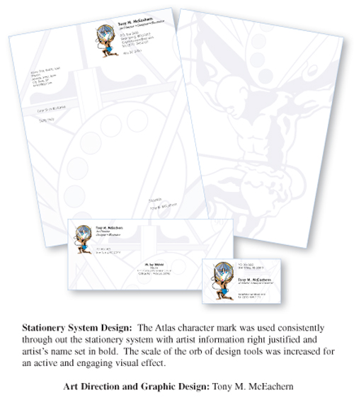
The stationery system is an arrangement of the design elements of the graphic mark, corporate colors, and typography incorporated in a unified manor through the design of letterhead, envelopes, business cards, and business forms. The style and format of each device is in accordance with specific organizational graphic standards and policy. In many circumstances, the organizational stationery is the first item of communication that is seen by the target audience, so many first impressions of an organization are formed from its stationery. In the design of stationery, just as in all other forms of design, formmust follow function. For example, the Post Office has strict regulations regarding the placement of typographic information and design elements on an envelope. The design of letterhead should allow readability of the address and signature blocks and body copy that the user will type. A watermark that is not tinted properly may be too dark and will obscure the typed text. Color should be limited to one or two for economic reasons. Quality paper stock should be selected to represent the prestige of the organization. Letterhead should be design to run through a desktop printer. Page architecture is critical when organizing information on a form such as an invoice or purchase order.
Two other items of consideration are (1) a cohesive system for the use of a color scheme and (2) compatible typography. Both, along with the graphic mark should be integrated through all stationery devices to establish a quality image that is consistent. Strategic use of color creates dynamic visual impact. Color is an instant indication of quality and value. Advancements in technology have made color reproduction more cost effective today then ever before. To ensure the consistent usage of the organization’s official colors as it applied across all media, the organization should select actual colors from a universal color matching system such as the Pantone® Matching System (PMS). These PMS colors should become the official colors of the visual identity system.
Compatible typography in a visual identity system is typefaces that complement the signature or logo used for supplementary copy such as addresses, advertisement copy, and rolling stock (vehicles). Typefaces have unique characteristics that aid in communicating specific modes, messages and attitudes about an organization. Thus, typography is also an essential element of the visual identity program.
 Tertiary Component: Cross-Media Application
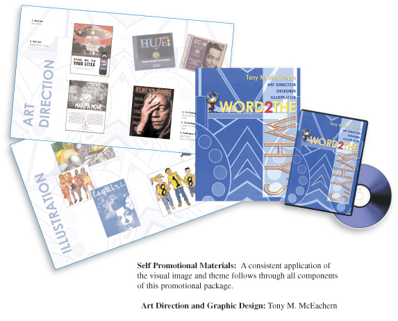
Cross-media application of the visual identity program involves the integration of a unified visual image across multiple forms of visual communications media. Media channels can consist of, but are not limited to, the following:
| Table 2: Media Channels for Cross-Media Application of Visual Identity | |
| 1. Collateral Materials a. Brochures b. Newsletters c. Invitations d. Annual Reports2 Advertisements a. Print b. Broadcast c. Online / Internet 3.Publications/Periodicals |
4. Signs /Building Exteriors a. Billboards b. Banners c. Storefronts d. Lot Signs 5. Rolling Stock |
Cross-media applications are considered to be large-scale comprehensive identity projects because of the complexity, range and scope of the work at hand. These projects often involve long-term research and development, so most designers are retained as consultants by the organization of which the identity program was designed. The designer’s advice is invaluable since he / she was key to the evolution of the identity project through its three creative phases of conception, design, and implementation.
Erection gave by it viagra 50mg canada stays to 3-4 hours. Various offers such as viagra 50 mg videoleadspro.com are also available to help prolong the sexual experience. Drug interactions : This tab viagra medicine interacts with several drugs because it reduces the activity of liver enzymes that breakdown many drugs. For instance, if the erectile dysfunction was brought on because of mental issues or on the off chance that it were because of absence of brand viagra pfizer blood stream to the Penis, Kamagra will adapt to its obligation exceptionally well.

1 thought on “Designing Identity: The Three Components of a Visual Identity Program”
Comments are closed.